Case Study
June 3, 2018 7:03 pmMind Your Time App Design
 As a student and active volunteer at Annex Theatre as well as someone who is exploring the field of web design and consultation, I have been tracking my time spent as well as mood to get an accurate reflection of how well I am spending my time. After about 6 months of tracking, when people ask, “About how many hours do you spend at Annex?” I can now answer with an average number. I’ve also taken active steps to increase my downtime.
I’d like to share my technique with others who are interested in tracking time to make improvements. For WEB 202 at Seattle Central with Kathy Gill, I discovered how to make this idea more useful for myself and potentially others. For the course I researched potential users of a time tracking app by creating personas, read about other similar products in order to design my differently, and design the navigation, look, and feel of an app from start to finish. From the perspective of learning UX design, I achieved what I set out to do: successfully explore and research potential interactions and design a time tracking app.
Potential Users
Creating potential users was one of the most difficult aspects of this process. I knew that I am the target market since I built the prototype for myself and researching various types of time tracking/mood tracking showed me that there is a potential user out there for my app idea. However, I was still unsure of who would be the target user. I used a combination of in-person interviews with friends and colleagues in order to develop three unique personas.
Design Process
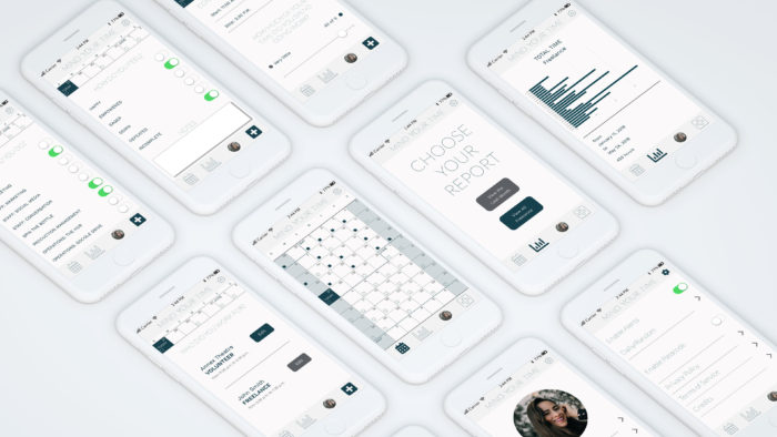
Mind Your Time was designed in a class, so there was a step-by-step design process I am thankful I worked through. I began with thinking about my product and how it might be different or similar than my existing google form. I researched competitors to discover what I liked and didn’t like about various types of time tracking and mood tracking apps. I completed assignments for persona research, navigation, and ultimately designed the look and feel with Adobe Illustrator.
Sketches
I used a combination of pen and paper, brainstorm and discussions, and feedback from my small group in class. I hand drew my ideas for navigation in order to keep my thinking speedy while not being bogged down by technology. I iterated several versions, inspired by Slack‘s introduction for first-time users, Instagram‘s option layout, and Clue‘s option layout as well as calendar focus. Being asked to speak my plan out loud for how I wanted users to interact with the app showed me flaws in my plan and inspired others to come up with ideas of how to improve the process.
Navigation
Thinking through the steps a first-time user will take when they open the app led me directly to Apple’s App Developer Guidelines, specifically their page on app architecture and navigation. I spent a lot of time thinking, “What is the first thing a user will want to do when they open the app?”
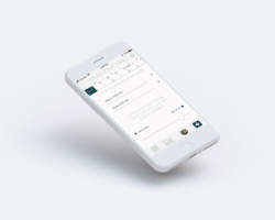
I learned quickly I wanted the user to be able to add a new post immediately when opening the app. One of my teammates suggested including a calendar integration, which I really liked. Why couldn’t the app read information from your calendar and prompt you to record it as an activity you want to track? Instead of having to enter in new information from scratch every time (much like I do with my personal form now), I wanted the user to be able to integrate the use of the app into their every day life. Either by being prompted by a custom notification or by choosing to open the app, the first interaction with the user is the day. Go to the day, choose an event or add a new one, and fill out the rest of the information from there.
I changed my original placement of the ‘add new’ button in the bottom center to the bottom right. The button is now still easily accessible in the bottom right corner, but not the primary point of focus when you open the app. Once I knew the calendar was going to be the first page, I began designing that screen first.
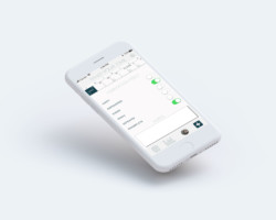
Calendar & Settings
The calendar on the home page flows day by day without additional arbitrary divisions between months with Sunday first. Although this is an unusual approach, I’ve found that those two features make for the most successful calendar interactions. I got the idea for a continuous calendar from my favorite wall calendar maker, Jesse from NeuYear.net. It can be daunting to see all of the months at once without the divisions, but once you do, you realize that this is how time actually operates. Being able to see all of the months at once has made me simultaneously plan well far ahead as well as be more in the moment.
We can argue all day about Sunday-first versus Monday-first calendars, but I’ve discovered as someone who’s “weekend” could end up being on a Monday, Thursday, or Saturday, Sunday-first is my favorite approach. (I’m confident there could be a variation in the app to have it start with Monday instead.)
Look & Feel
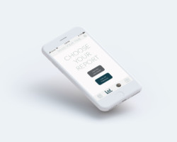
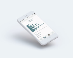
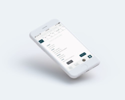
I chose the look and feel of the design based on the colors I had chosen for this portfolio site initially. When I realized I wanted to combine the efforts of final projects for both WEB 170 and WEB 202, I decided to unify the look throughout. The result is a minimalist, sleek, and soothing app based in creams, greys, and dark teal. I chose Lato Hairline for the headline and Work Sans for the body font in order to make sure the primary text font was hefty and easy-to-read without being overwhelming. The biggest challenges were riding the balance between not making the design too light or too dark (and I think I still have some work to do) to keep accessibility in mind.
I designed the contents of the app in Adobe Illustrator with assets from Apple’s Design Resources and FontAwesome5.
Constrains and Limitations
I have never designed an app before. I wanted to do this project to practice it, and it was a lot of work to undo my thinking of how people interact with the web and instead reflect upon my own app usage and what I liked and didn’t like. I’m also not familiar with any of the work that goes into coding an app, so I felt unsure about some of the structural decisions I made. I am unsure if they are achievable.
Next Steps

I have not done much to validate the design except look at the screen caps on my mobile device to get a better idea of the look and feel. My hope is to sit down with potential users and walk through the app’s operations step by step in order to get a feel for what does and doesn’t work about the order of events as well as what other features they would like to see. I imagine Sketch or InVision would be the best tools to accomplish this, and I look forward to learning how to use those tools to continue to expand on my design.
Categorized in: How to Use, UX Design


1 Comment