
Seayoung Yim
August 20, 2018 Seayoung Yim is a Seattle playwright and activist. She asked me to digitize her logo and redesign her personal website in summer 2018.Digitizing the Logo
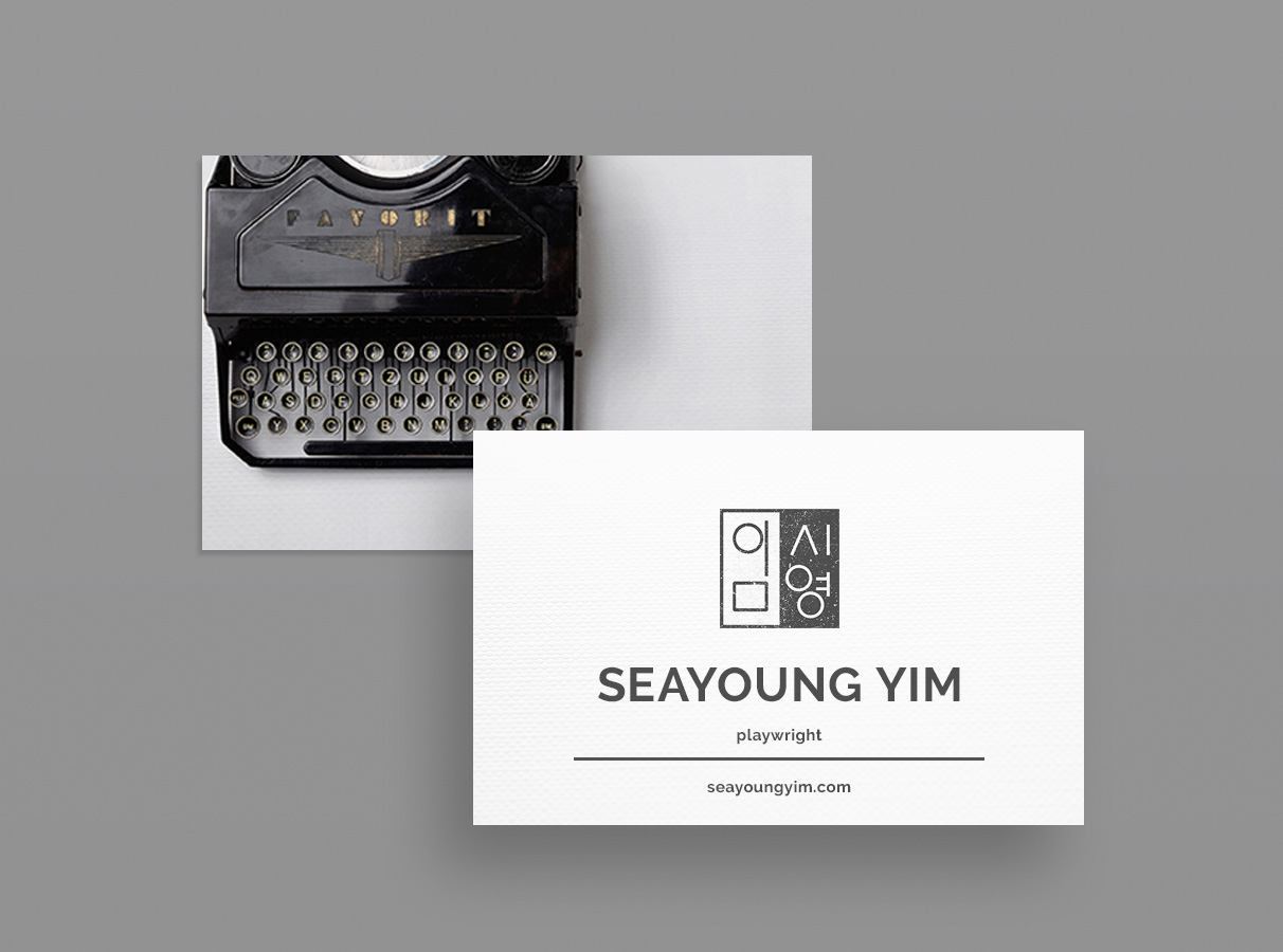
Seayoung’s logo is a modernized version of her name in Korean characters, digitized to look like a stamp. As an artistic representation of Seayoung’s name in Korean characters, the stamp incorporates her heritage with a modern sense of style. I used a scanned photo of the printed stamp to design a digital version in Adobe Illustrator. I layered in a texture I found through Spoon Graphics to give it a worn feel. Paired with Seayoung’s full name in text, this logo is the header of her website and featured on every page and the square logo on its own is the favicon.Website Redesign
I used the redesign project to complete one of three required internship credits at Seattle Central College for my web design certificate. To begin the process, we met for a consultation so I could learn what she did and did not like about her existing website’s design, content, and hosting setup. Following our meeting, I suggested a condensed structure and new WordPress theme to display an eye-catching navigation bar, emphasize the great production photos Seayoung had access to, and elevate the design to be more professional throughout. Seayoung had told me she wanted to incorporate some color, but was drawn to a minimal black and white style. I created an inspirational Pinterest board with elegant images that included hints of neon and deep red from nighttime signage, flowers, and auditorium seats. When I was searching for images, I continually thought about the styles that would best suit her aesthetic to remain minimal and professional. For the theme, I searched for simple and straightforward blog templates that could accommodate large pictures, since several of Seayoung’s production photos easily incorporate a dramatic punch of color. We decided on Kale, which has a lite version available to install through WordPress.org. I created a development instance on my personal server and began to learn Kale’s nuances. The look suited Seayoung and integrated elements she liked from the theme. Then, I tried to install it on her site. Seayoung has been maintaining her website through a free WordPress.com account. When I investigated how Seayoung’s site was arranged, it looked like she would need to upgrade her plan to take advantage of the theme’s capabilities. So we upgraded to Personal, but even with that account tier, a user cannot install their own themes. Kale can only be installed on a Business Plan, but we only upgraded only to Premium because we had access to several themes, two of which were similar to Kale in look and feel. Now I could find a theme that could be adapted to showcase the features Seayoung and I liked from Kale. And, if it didn’t work out, I could try another theme without backtracking too much. Because WordPress.com uses much more of the GUI and handy drag and drop features, I utilized the Customize feature to make most of the changes. Then I used the Chrome Inspector tool in a more targeted fashion than I ever had before. After I installed the new theme (Olsen) I learned I could control ALL of the CSS! For the sake of time, I did not clear out the entire site’s CSS and start from scratch, even though I really wanted to. Instead, I identified similarities between the Kale version on my server and the new version based on Olsen, targeted key selectors and modified their properties. And when I needed to make edits or when I eventually have to give someone else access, they will know what I was targeting and why because I labelled everything with comments. I added text to the landing page that stated exactly who Seayoung is and what she does. Paired with a picture of her most recent production, the result is a dramatic introduction to a dramatic playwright. The outcome is a beautiful site that Seayoung was excited to share immediately with her community. Visit SeayoungYim.com.Categorized in: Case Study, Logo Design, Website Design
